Why Bother Making it Visual?
24 Feb, 2020 | By leslie@leanexpansion.ca

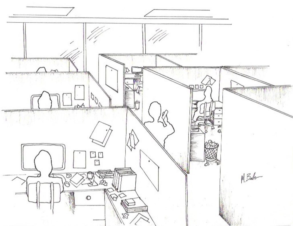
I walk through the office. The atmosphere is tense. Customers are demanding deliveries or fixes or both. Everything is a rush. Everyone is frantic. Just get it done. There are so many projects with seemingly insurmountable problems. It has always been this crazy. It’s just a normal day in software development.
The problems that caused this scene cannot be seen. I can ask what’s happening, and I do. The answer seems to be different, depending on who I ask or when I ask it. “The client didn’t set up the correct configuration for the hardware,” says one. “The tests on some of the transactions are failing,” reveals another. “They are asking for more than the original design of the code,” another informs me.

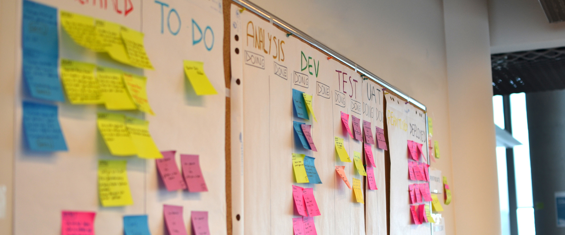
How can we make this better? It has to start with making the work visible. Even in this fast-paced, high tech environment, the basics of visual order are needed, maybe even more so. Mark, the COO, has some experience with lean concepts. He’s never seen it applied in software development before though. But he’s game to try, knowing he has to rise above the day-to-day and drive the improvement that makes it better day-after-day.
Mark knows it will be a tough sell, to make the work visible. He’s been through it before. Visual order never seems worth the time or effort. Without it, it is hard to know whether people see the same trouble as you do. With it, there is less effort to understand what is happening. People naturally see and understand problems much quicker. People pitch in faster, or at least stay out of the way, when ahead or behind status is seen.
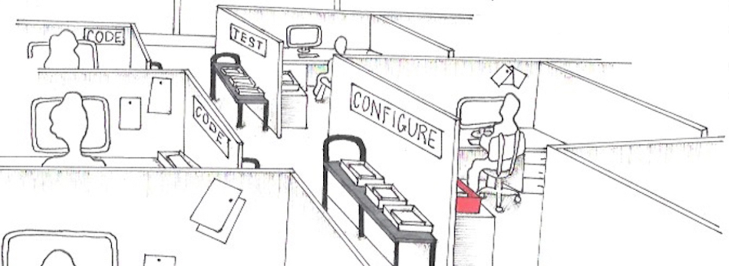
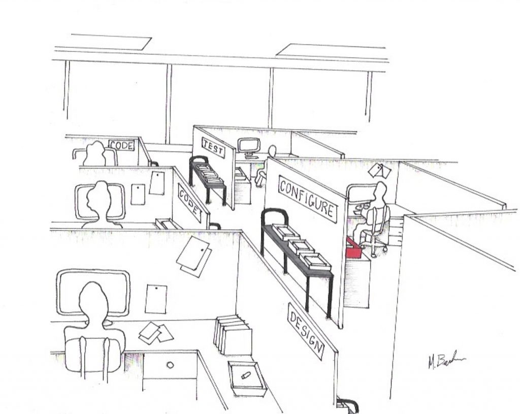
The team starts with visual work queues for design, code, test and configure. One box is created for each project, holding critical information. It was not an easy task. There are a lot of open projects. It’s gotten out of control, with no sense of FIFO. People argue over what information belongs in the box. Some hate printing out duplicate information. Some want too much information, rarely referred to. Some just want to hide from the idea of a visual workplace. Many fight it. Mark explains. He listens. He stays firm to the idea of see together – know together – act together. He lets his people decide how it will be done but not whether it will be done.
The visuals are simple. Each piece of work equals one box. It is queued up in front of each work area as it progresses from design through code, test and configure. WIP between process steps is visible. As each project is worked on, it is moved to the desk where the work is happening. FIFO and time can be seen in the queues between processes and the status of any project can be seen in the daily walk path.
Today when I walk through the office I see the same cubicles but I also see the work. The visual system has come a long way over the last year. Innovations to make problems more visible have occurred. Projects in process are in white boxes and fixes are in red ones. Most importantly, problem-solving on the work has occurred. Flow-through racks between steps have been set up to stop people from grabbing any project other than the next in queue. Daily walks by the leaders help them understand how long a piece of work has been sitting with someone, leading to a better understanding of who has what skill, and a concerted effort to close the gaps on the necessary skills for the customer demands.

Not all of the problems have been solved but when they cause a “behind” situation, all hands jump in to help more immediately. Overall, year over year, quality has improved with a reduced number of fixes needed. Delivery has improved too. It hasn’t stopped the demanding customers. It has only fueled them. The more they get, the more they want. But that is okay. Mark can now see the queue of problems to be solved to get even better.
Everyone can see.


